
Open MCT for Mobile
This project, which took course over a couple of months, involved taking Open MCT– a software whose original and main purpose was to be used on a desktop, and make it more mobile-friendly. I not only prepared designs, but also developed code to solve multiple problems.
BACKGROUND.
When I joined the Open MCT team, our primary objective was to make the software mission-ready for VIPER. This meant that our main focus was on mission operators, who relied on the software to display very complex mission data on desktops or large screens.
However, as the project evolved, DIY Mission Control started to emerge– a project whose main use case and projected audience were going to be mobile and tablet users. Because Open MCT was the main foundation for DIY Mission Control, we needed to ensure that Open MCT was able to handle the new user base.
USE CASE.
Before even starting the task, there were many challenges and questions that I had from the beginning. These were a few of my main questions, simplified:
THE CHALLENGE.
(1)
Open MCT is a very data-intensive software.
How can we improve the mobile experience such that the UI is not too crowded and overwhelming for a user?
(2)
There are so many features that were originally designed with desktop in mind.
How can we refactor the design and code such that it flows seamlessly between devices?
GOAL.
Find a balance between usability and functionality for a typical mobile user.
Redesign parts of Open MCT's UI for mobile such that the overall mobile experience for a user is improved. Responsive UI is a must!!
Fix any bugs that currently exist with Open MCT on a mobile device.
Ensure that the improved mobile experience includes devices of all types (Android, Apple, Tablets, etc).
I began rigorously testing the Open MCT's mobile experience by mimicking the actions of different users on the app. I ended up with a long list of bugs, enhancements, redesigns, and more.
NEEDS FINDING.
 |  |
|---|---|
 |  |
 |
Easier User Gestures
Throughout the mobile UI, I found myself having to click a lot more than I would have liked to be able to do something. That was a bit frustrating.
Missing Features
There were a couple of features on desktop that somehow did not make it to mobile. They needed to be added into the codebase.
Redesign Some Features
The mobile UI was extremely cluttered. It definitely needed some redesigning and simplifying.
Update Device Detection Library
Honestly, this was the root to a lot of our issues. Our device detection library had not been updated in years, causing inconsistencies in the transition between the mobile and desktop experience
DESIGN PROCESS & FINAL DESIGNS.
I then began to tackle each of these main problems. Some required wireframes and designs to initially be made on Figma, which I later turned into development work. Meanwhile, others required did not require any initial design, but rather only development work, where I made changes to the code base.
These are some of the key changes I made to the mobile user experience for Open MCT:
Improve Mobile Gestures
For context, Open MCT on desktop is organized into three main sections: (1) Object Tree (2) Display Area (3) Inspector. Refer to the picture here:
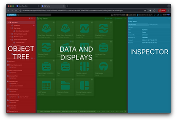
Obviously, on a desktop, there is a lot more real estate to present all of this data on one screen. On a mobile device, this is a lot harder. Previously, the mobile UI was set up such that the Object Tree and Displays were shown at the same time together. With the lack of space, both features were essentially unusable. In addition, one of the main interactions users have with Open MCT's UI is the ability to navigate between different elements from the Object Tree, and viewing its data in the middle section. With the current mobile layout, not only were the items in the Object Tree were being cut off, and the displays were hardly being shown. In addition, users would manually have to close the Object Tree with the click of a button to view any displays.
I had to come up with a way to fix this problem. How could we redesign the mobile UI such that:
THE SOLUTION.
The best solution was the following: each "pane" of Open MCT takes up the entire device space, such that users have no issues with elements being cut off. To solve the main concern of not being able to browse through different elements in the tree, the following design was created. Once an object from the Object Tree was clicked, the tree would automatically close to show the contents of the object. If a user wanted to use the Object Tree again, they would use the 3-dot menu located at the top left of their screen to open up the tree. The automatic closing of panes would help solve the problem of unnecessary clicking, and the solution of each pane taking up the entire device space would help solve the issue of the UI being too crammed. I was able to solve these problems with the use of Vue.js.
(2)
We limited the number of user gestures to increase productivity?
(1)
Every main section of Open MCT was usable to its fullest capability?
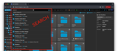
Mobile Global Search Implementation
Open MCT's global search was missing from mobile completely. My main task here was to not only implement it back into UI, but design it in a way that was usable for a mobile user.
On a desktop, a search bar is always available for a user to input keywords. In addition, the search results appear as a popup overlaid the entire UI. However, with the minimal space available in mobile, neither of these current designs on desktop would have been possible for mobile.
THE SOLUTION.
The best solutions were the following:
(1) Remove the search bar, and simply use the search icon instead. Once a user clicks on the icon, use CSS animations and JavaScript to expand the search bar for a user to start their search query. Once a user clears the search input, the search bar will disappear again.
(2) To make the search feature as functional as possible, make the search results appear in fullscreen mode, rather than an popup like in desktop. This allows for users to see all of the results without issue, with lots of space to click on a result.
(3) To minimize user gestures, once a user clicks on the search result, the fullscreen will close and automatically take the user to their selected object.
Object Tree, Recent Objects Redesign
Open MCT's Object Tree capability allows for users to easily browse and select objects that were created by the user. It has a couple of main features to it in order to maximize the functionality for a user.
(1)
Each object in the tree contains the following information:
-
Object name
-
Pathway to where the Object is located. Sometimes, this path can be very nested.
(2)
Recent Objects feature, which provides a list of the most recently-visited objects. This is useful for users when creating complex layouts– rather than using the Object Tree, which can become extremely complicated, they can use this feature to navigate back and forth between objects.
THE SOLUTION.
I had to make a couple of improvements to both features in order to improve the mobile User Experience. Firstly, I had to increase the hit area significantly for the names of the Objects in the Tree, as well as re-style them to indicate that these elements can be clicked on. Playing around with different designs, I decided on doing this by adding a light-color background around the objects that can be selected.
Similar designs had to be made to the Recent Objects feature. Additionally, I utilized CSS and JavaScript to address and resolve issues that appeared from the desktop version's inadequate responsiveness to mobile devices.
For example, I fixed the way that the confirmation dialog looked when a user tries to clear the data from the Recent Objects. The overall layout of the Recent Objects and Object Tree were completely broken as well, so I had to do a little bit of code refactor for that.
Time Conductor Redesign and Enhancements
The Time Conductor controls the time bounds of data queries for many Open MCT view types. It is located at the bottom of the screen, and has the ability to switch between real-time, local, or a fixed timespan. It is a very prominent part of Open MCT– it is used by just about any user.
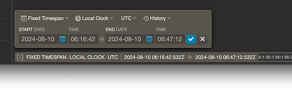
As you can see in the picture above, the Time Conductor settings are laid out in one line. This is easy to comprehend to a user– it almost mimics reading a line of a book.
However, this original layout for the Time Conductor on mobile does not work as well. Due to size constraints, the feature ends up actually being cut off the screen, making it unusable. So, the design problem here was:
How can I restructure the mobile Time Conductor such that it is usable on mobile, yet just as intuitive as it is on desktop?
THE SOLUTION.
In order to fit the Time Conductor into a mobile device size, I had to increase the height as the width decreased. Additionally, the Time Conductor read from left to right, then up and down– similarly like a book! All of the "Start" inputs came first, and the "End" inputs came on the line below. By doing this, I was still able to keep the UI intact, and with a user's intuition, they would be able to easily read the settings without a problem.
This design solution required me to do some heavy code refactor on the Time Conductor. Due to the way we originally had structured the Time Conductor using grid, it would not have been possible to turn a one-line grid into two. Therefore, I restructured the code such that we could have a one line design for Desktop, and two lines for Mobile.

Mobile Time Conductor